Logo
Logo Versions
The Amount of space that a logo must have
on all sides, no matter where it is used. This
distance should, be equal to or greater than the width of the Rugs USA “R”.

Icon Mark
The Amount of space that a logo must have
on all sides, no matter where it is used. This
distance should, be equal to or greater than the width of the Rugs USA “R”.

Clear space:
The Amount of space that a logo must have
on all sides, no matter where it is used. When
using the “R” icon the distance should, be half the height of the Rugs USA “R”.
Brand Overview
Rugs USA's aesthetic is:
Simple but not minimalist
Cost effective but not cheap (looking)
Promotional but not tacky
Approachable not aspirational
Helpful, not instructional
Typography
Roboto
ABCDEFGHIJKLMNOPQRSTUVVWXYZ
abcdefghijklmnopqrstuvvwxyz
1234567890!@#$%^&*():;"'—–
Roboto Black | Roboto Black Italic
Roboto Bold | Roboto Bold Italic
Roboto Medium | Roboto Medium Italic
Roboto Regular | Roboto Regular Italic
Roboto Light | Roboto Light Italic
Raleway
ABCDEFGHIJKLMNOPQRSTUVVWXYZ
abcdefghijklmnopqrstuvvwxyz
1234567890!@#$%^&*():;"'—–
Raleway bold | Raleway bold Italic
Raleway Semibold | Raleway Semibold Italic
Raleway Medium | Raleway Medium Italic
Raleway Regular | Raleway Regular Italic
Raleway Light | Raleway Light Italic
Raleway Thin | Raleway Thin Italic
Colors
Primary brand colors
Secondary brand colors
Tints & Shades
Pewter
Blue/Gray
Gray 4
Navy
Orange
Peach
Hibiscus
Cherry
Teal
Iconography
Additional iconography from Font Awesome
Instances where
icons should be used:
- for system icons (ie. account, cart/bag, free shipping, low price commitment)
- for website and/or app interface icons
- for weave and material type
- for pile height/softness
Instances where icons should not be used:
- to show a scene
- to communicate a complex topic
- to show products in use or being used
- to do storytelling
- showing lived in spaces
- explaining abstract conocepts
- showing styling with lamps, poufs, rugs, wall hangings, pillows, mirrors, etc.
Graphic treatments and Illustration
Graphic Treatments for sales
- Graphic treatments for sales should use organic
shapes and lines
- Shapes can and should overlap each other
- Do not use textures for graphic treatments
- Use vector shapes or create flat shapes with
the pen tool in Photoshop
- Leverage vectorized versions of rug SKUs:
- for a promotion or message that focuses on that particular SKU or collection
- use sparingly for site sales not related to a specific SKU
- Graphic treatments should not be overly busy or cluttered
- Graphic treatments for sales should include abstract, rounded flat shapes
- Graphic treatments for sales should not include illustrated depictions of:
- people
- scenes
- animals
- objects
- objects that are part of the pattern of a SKU ie: leaf shapes, and floral patterns can be used
- graphic treatments for sales should include
combinations of 2-3 colors from the color
palette including tints and shades of
those colors
- graphic treatments and illustrations should
only use the colors within the color palette
including tints and shades
- line and shape can be used together for graphic treatments
Examples


Graphic Treatments combined with UGC for sales
- when using a combination of UGC and graphics, the graphic treatment should function as a background for copy to be placed on. The background should not overpower the copy or the UGC image.
- Borders should never be used on the homepage hero
- The copy on the graphic treatment should always be legible and prominent.
- There should never be straight lines to divide the graphic treatment from the UGC or photo
Examples
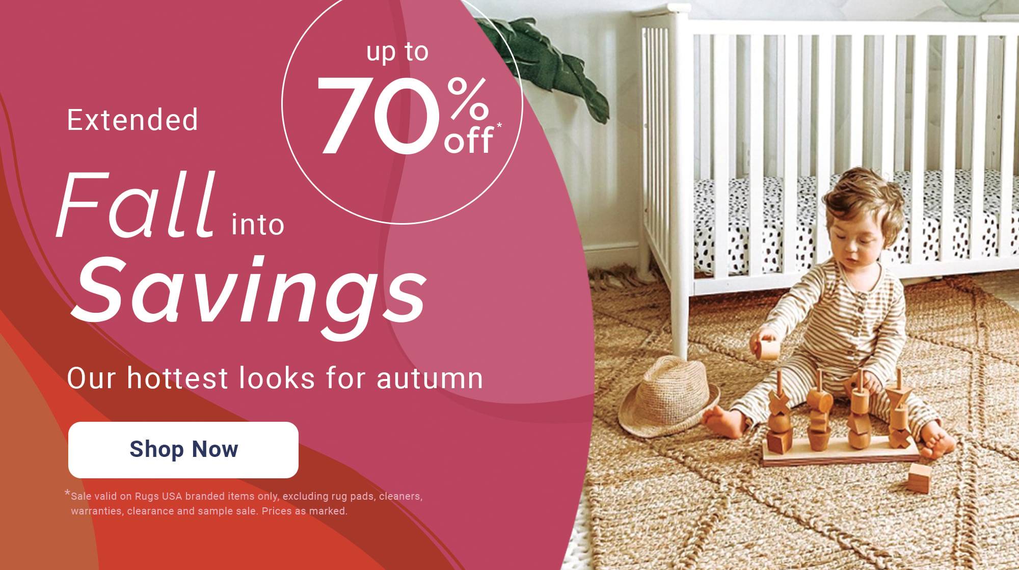
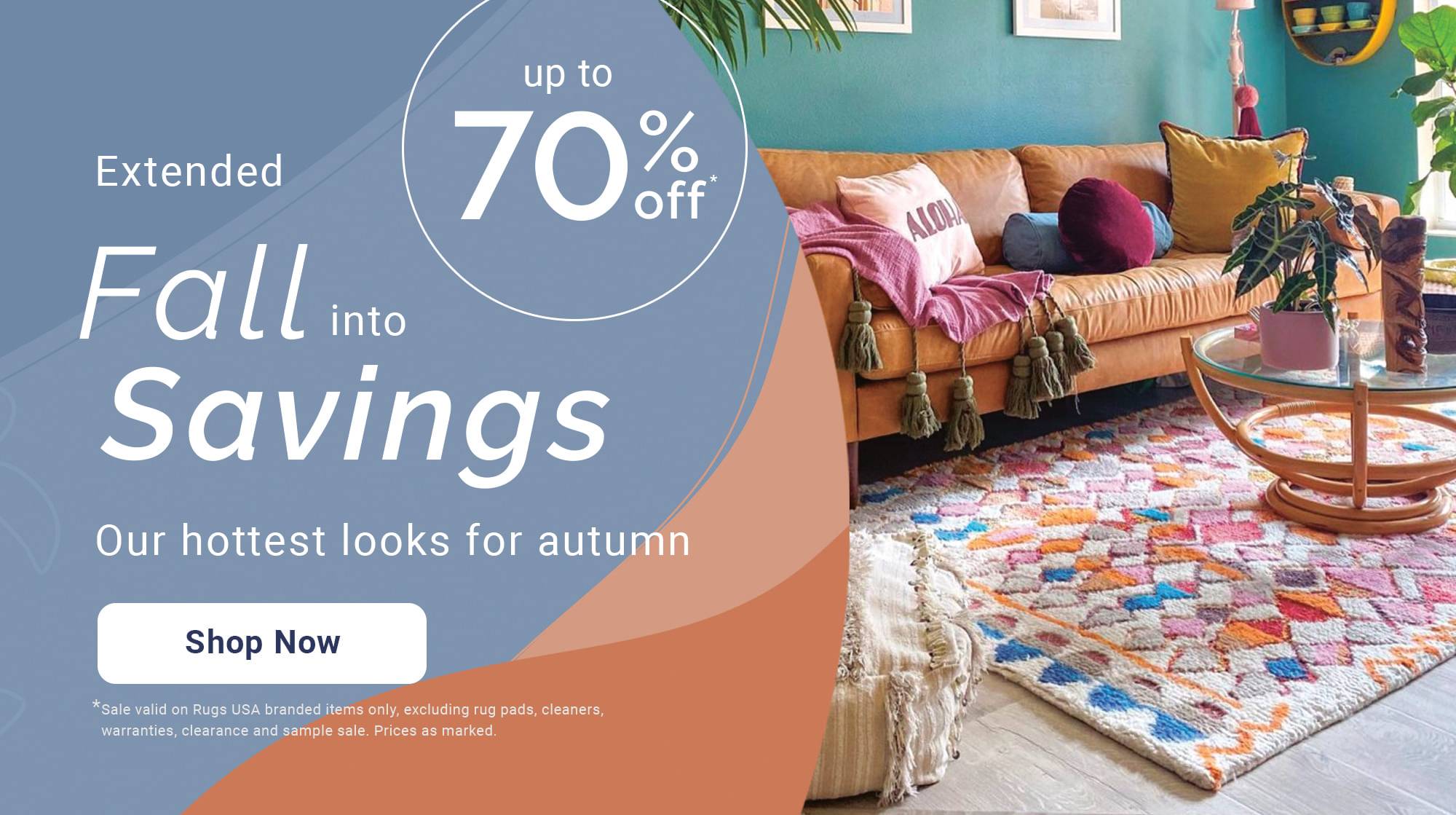

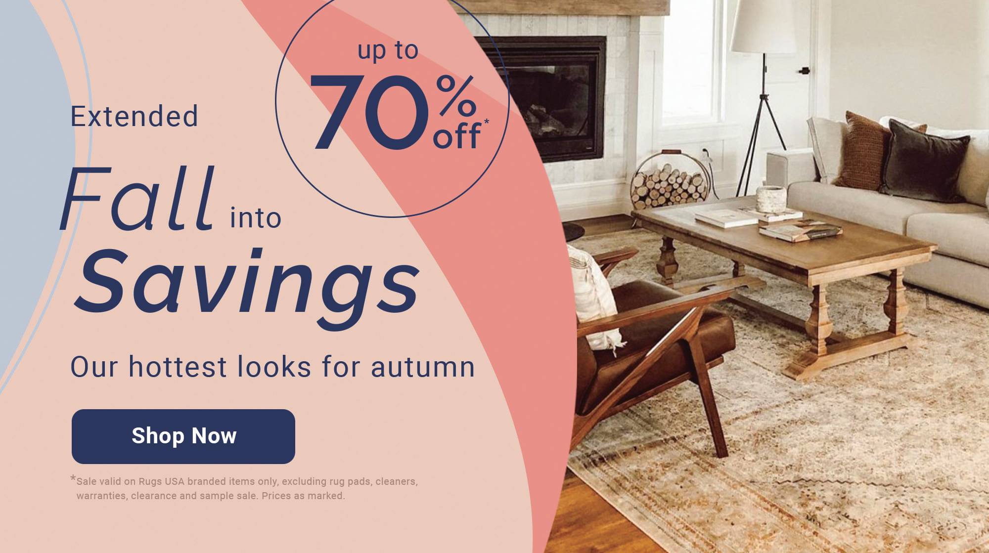
Illustration Guidelines
- should be used for spot illustrations to represent an idea, concept, or scene
- should not be used to represent the human figure (use photography instead)
- should not be used as a replacement for system iconography (free shipping, returns, low price commitment, account, search etc...)
- Should use colors/tints/shades within the palette
- color schemes within any single illustration should be limited
- if the illustration is part of a series of related illustrations, the color palette should be the same
- the highlight color should be “cherry” from the color palette
- Rugs should always be represented in the “cherry” color
- when a rug is shown in an illustration, it should always have a pattern
- All illustrations should be vectors
- All spot illustrations should include a rounded organic shape behind them
- all other shapes within the illustration, aside from the rug, should be flat shapes without pattern or texture
- shapes should not be outlined ie: line should not be used to define shape.
- objects in an illustration should have an established light source
- illustrations should not use gradients
Illustration creation
- Using Adobe Illustrator, all strokes should have a round cap and corner
- For illustrations where showing perspective is important to conveying the message, use isometric perspective. (ie: showing the dimensions of an object)
- illustrations should be 2-dimensional or 3-dimensional representations of objects.
- illustrations are not icons
Isometric Perspective Spot Illustrations

1-Point Perspective Spot Illustrations

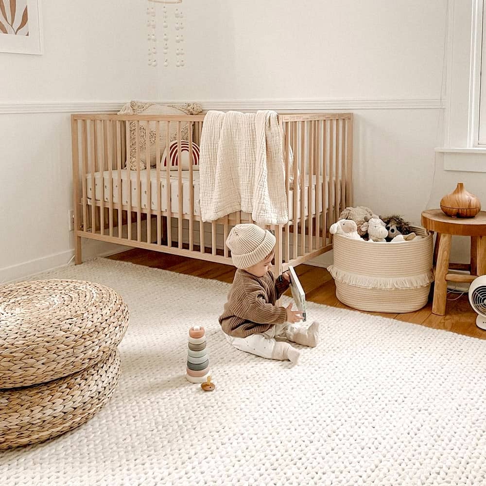
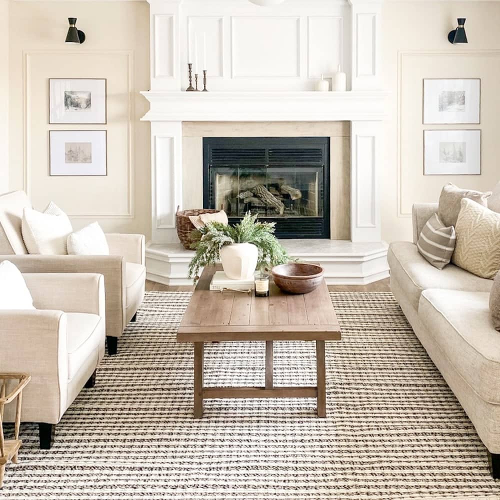
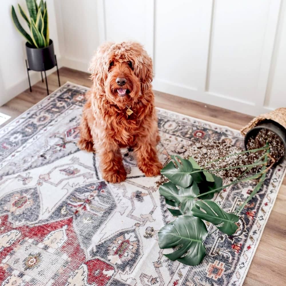
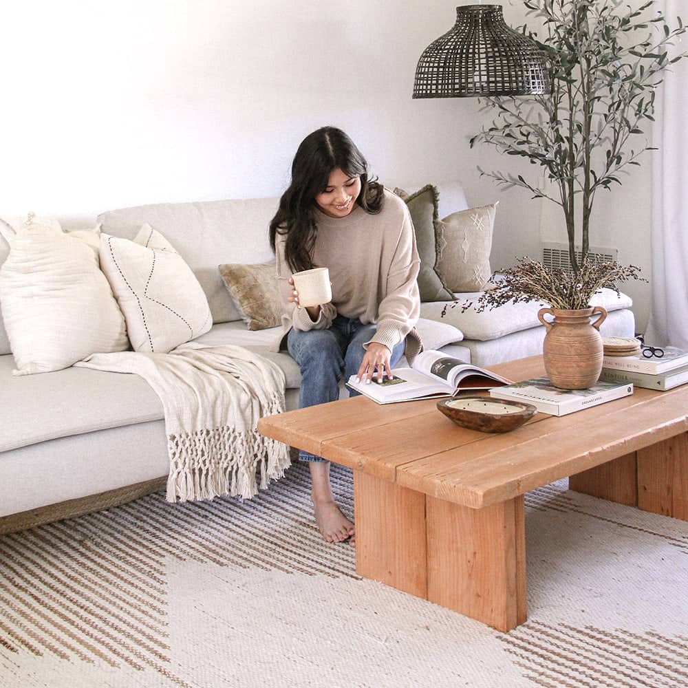
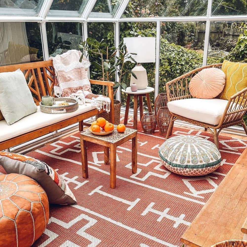
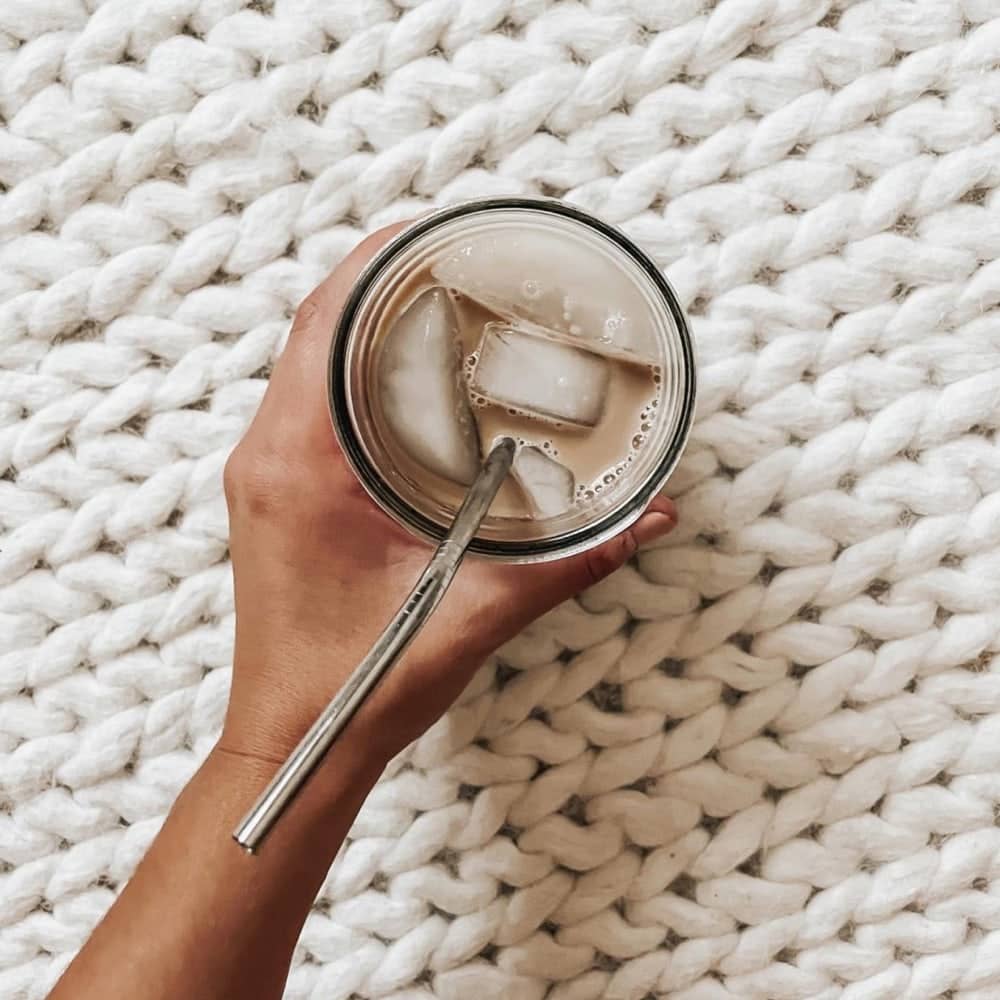
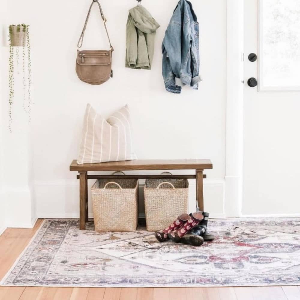
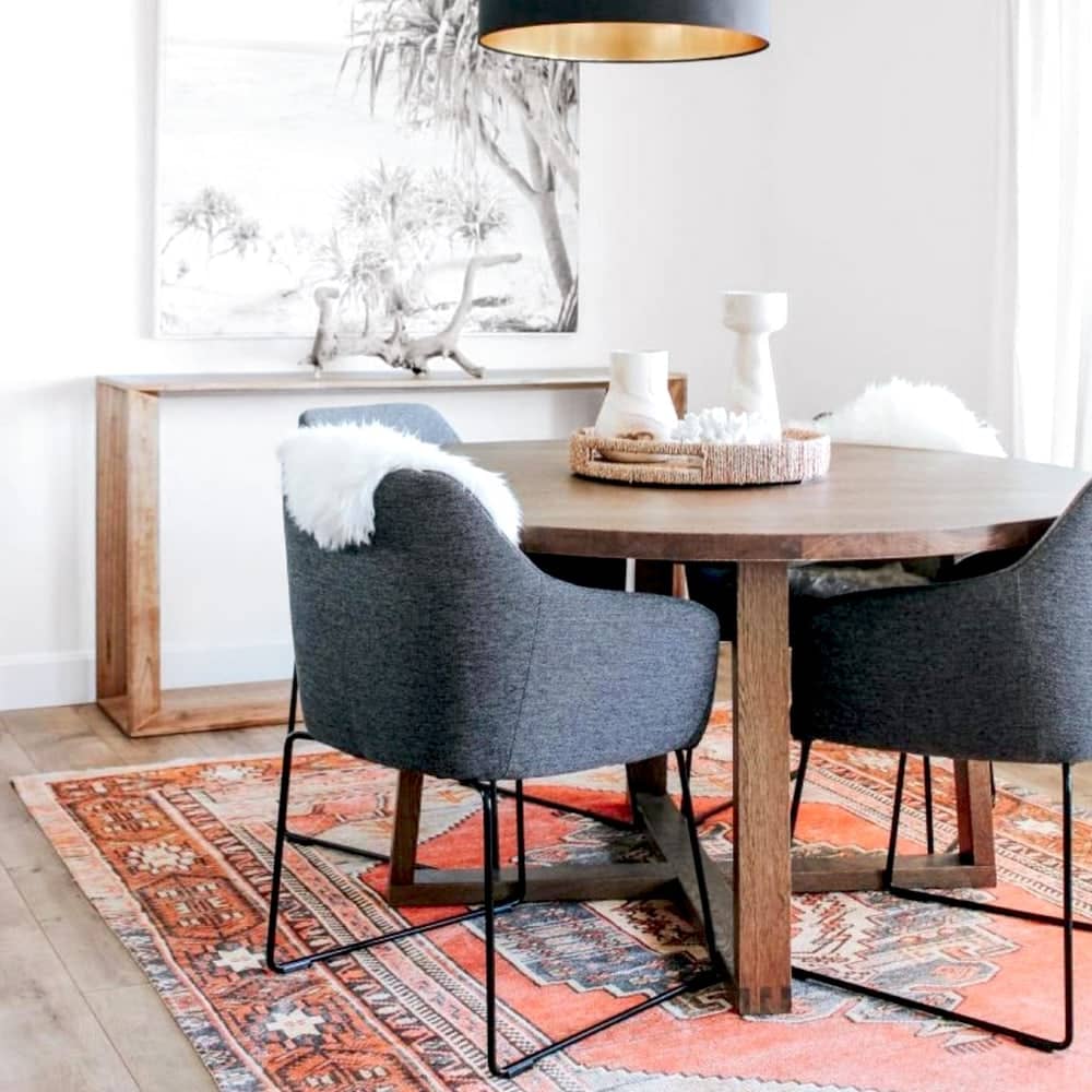
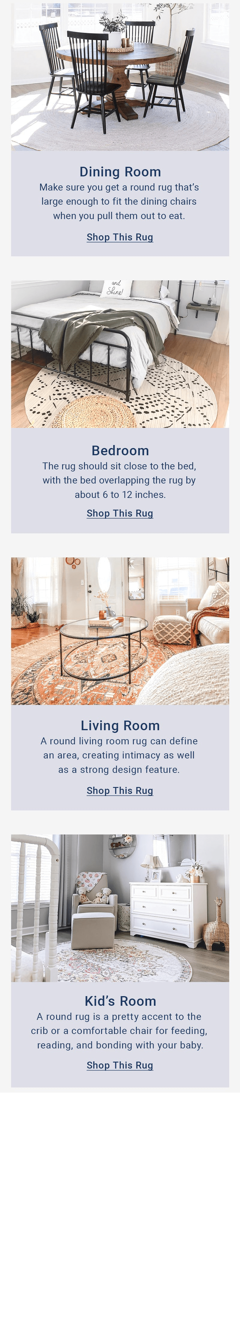
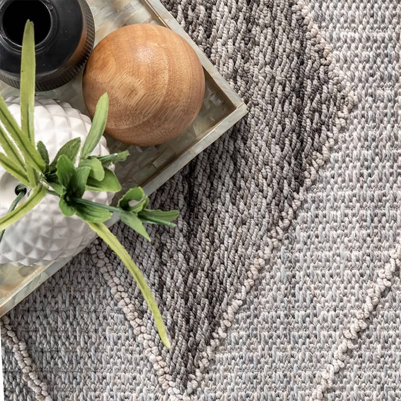
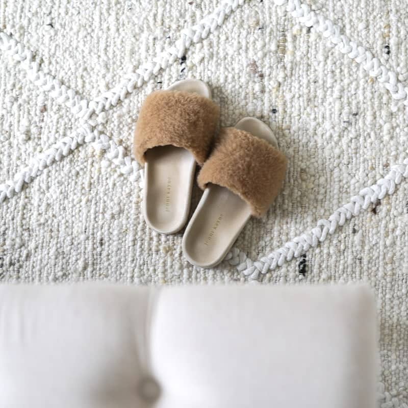
UGC Photography
Choose photography that has an authentic, lived-in feel. Where possible, feature:
- People
- Pets
- Props to show how each space is unique
Break the monochromatic scheme with more colorful UGC photography that appeals to a broader range of home creators.
Mix in photography that uses different angles, close-ups and overhead shots to infuse life into the social feed.
Print
Primary brand colors
These guidelines should be applied to printed advertisments, inserts, mailers, and promotional materials, tags, and merch
Orange
C=0% M=78% Y=64% K=0%
New Navy
C=100% M=87% Y=35% K=26%
Gray 2
C=6% M=4% Y=0% K=0%
Gray 3
C=12% M=9% Y=3% K=0%
Gray 4
C=34% M=28% Y=16% K=0%
Secondary brand colors
Teal
C=66% M=20% Y=29% K=0%
Blue Gray
C=87% M=66% Y=40% K=24%
Pewter
C=33% M=18% Y=10% K=0%
Peach
C=8% M=38% Y=39% K=0%
Cherry
C=26% M=100% Y=71% K=21%
Hibiscus
C=16% M=82% Y=37% K=0%
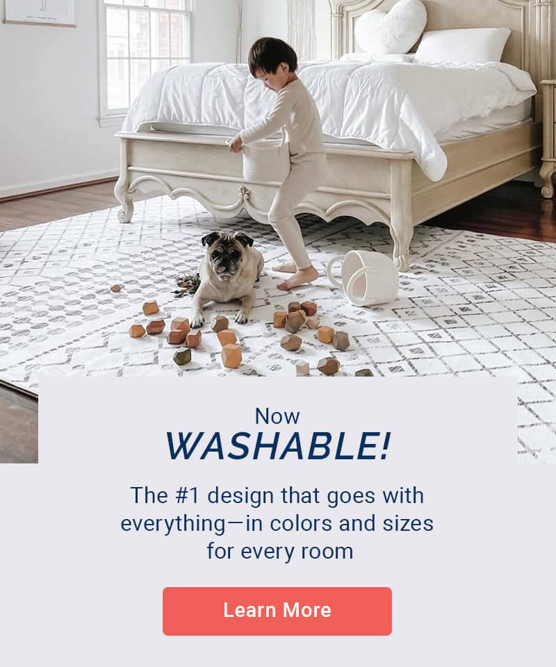
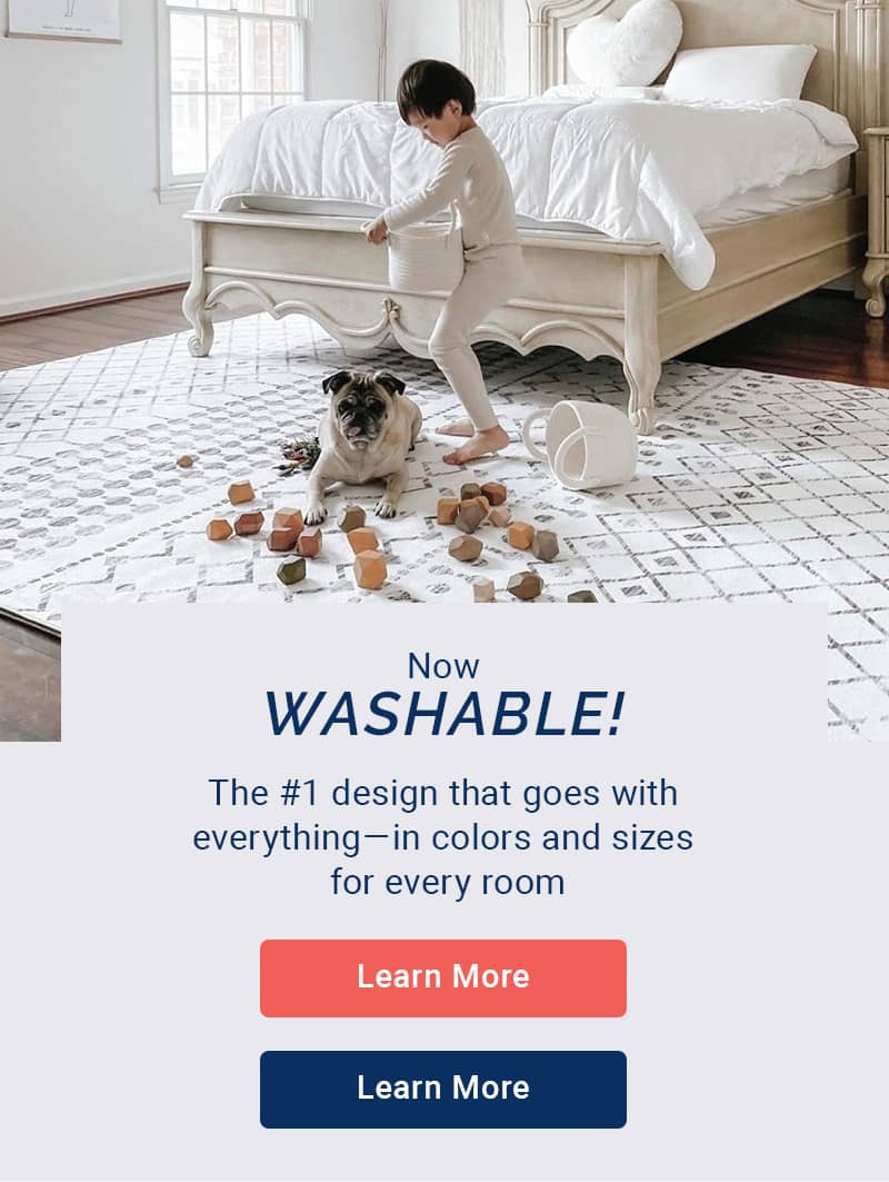
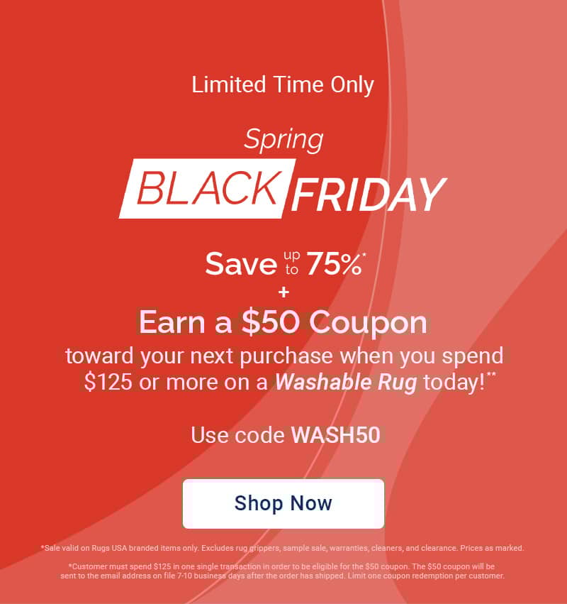
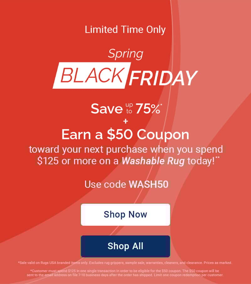
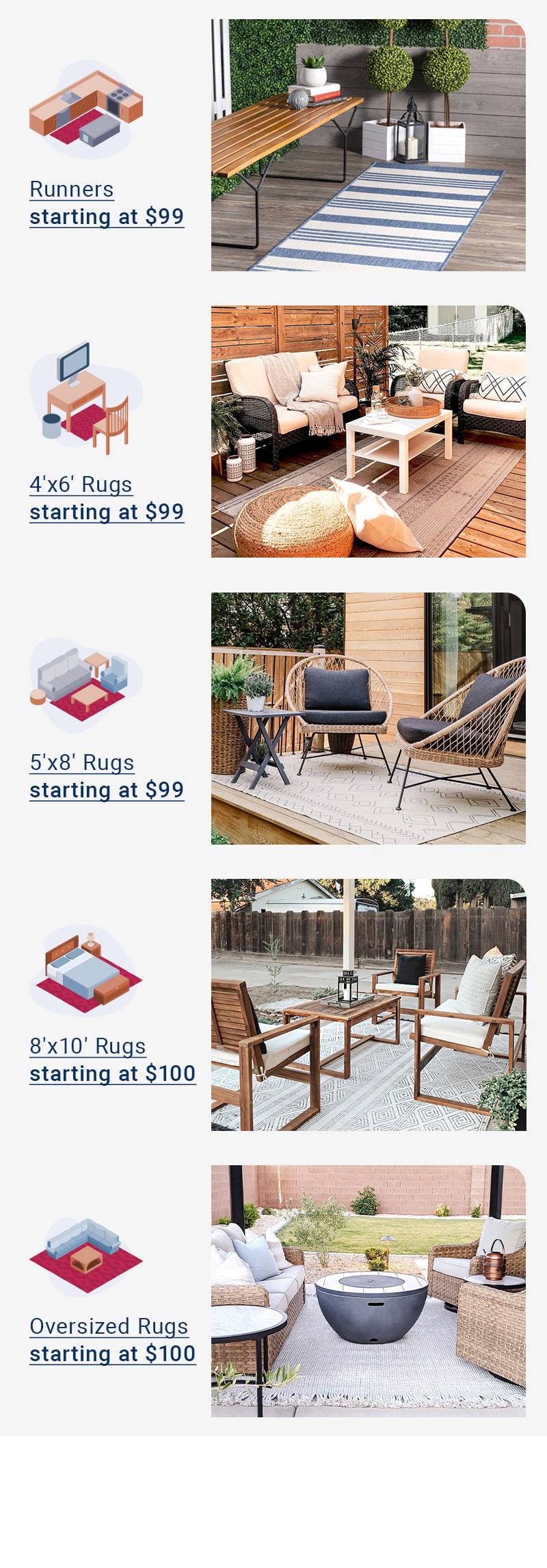
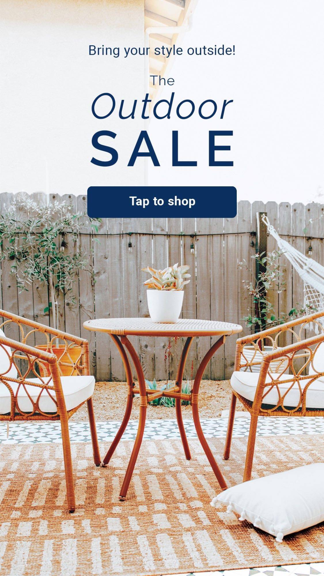
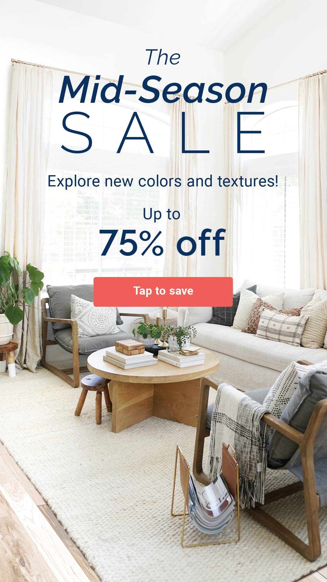
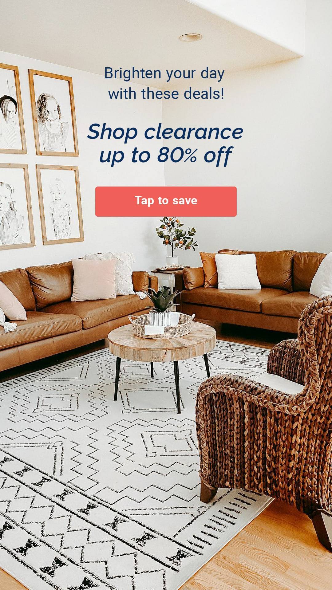
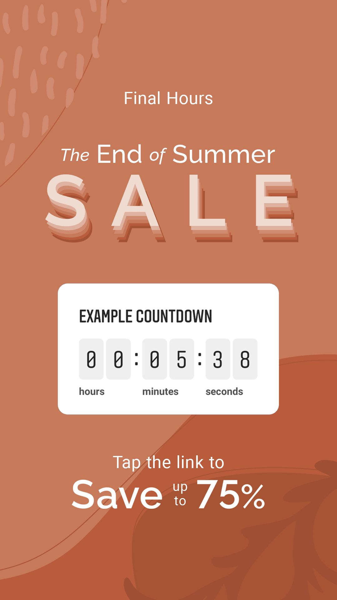
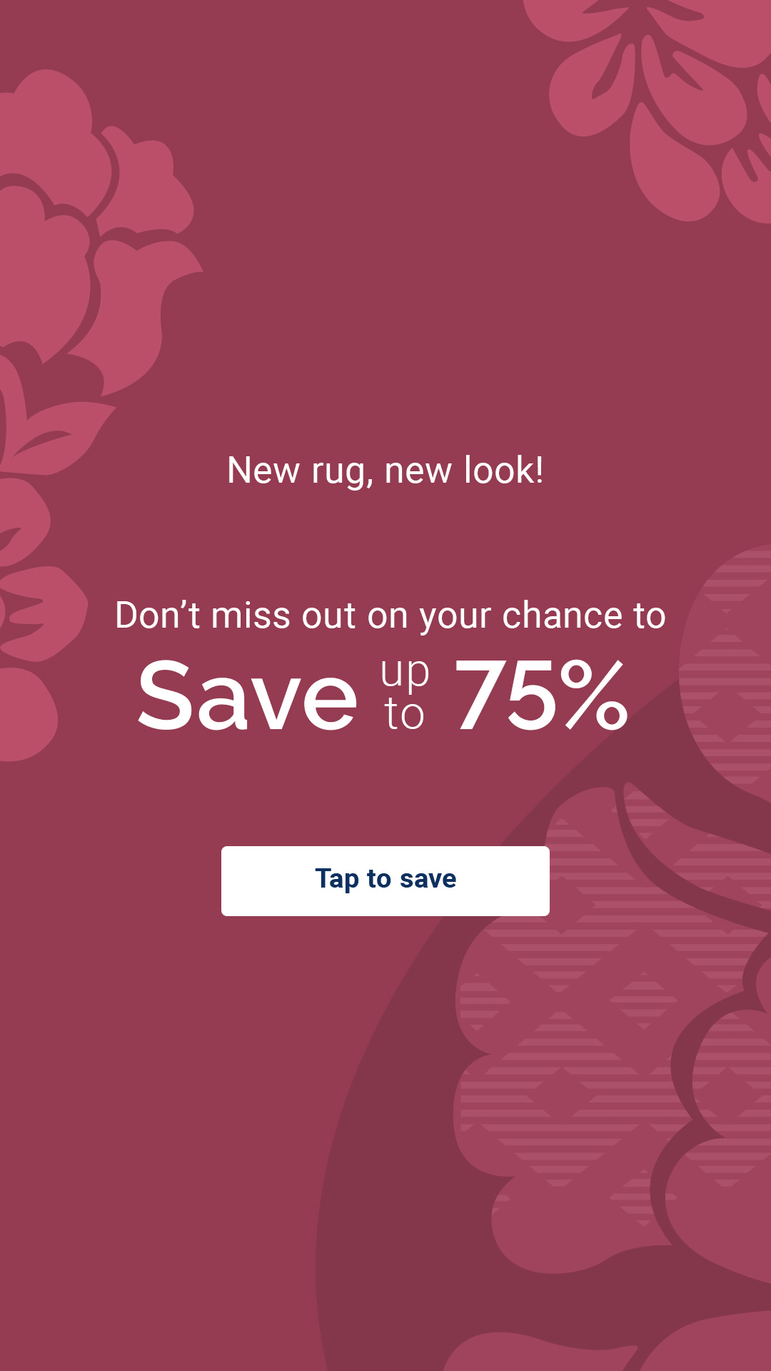
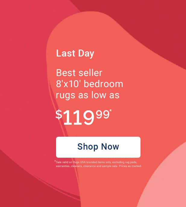
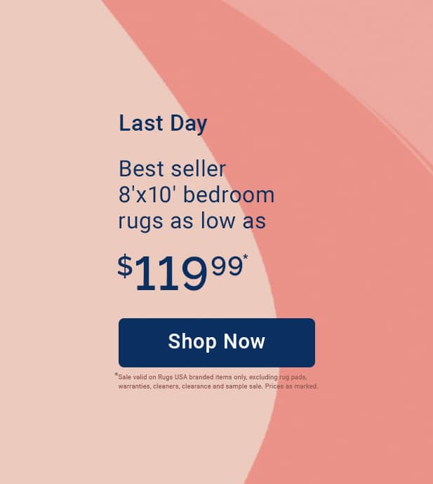
Site Assets
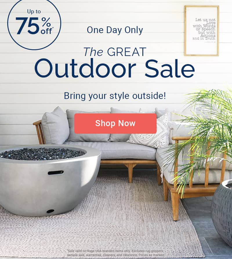
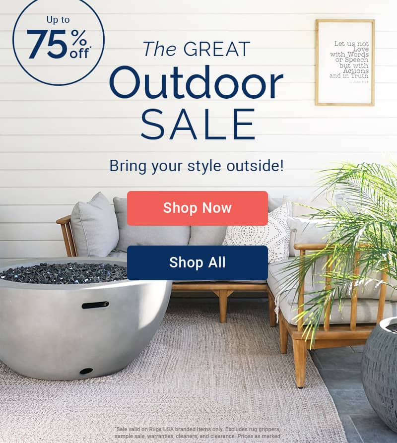
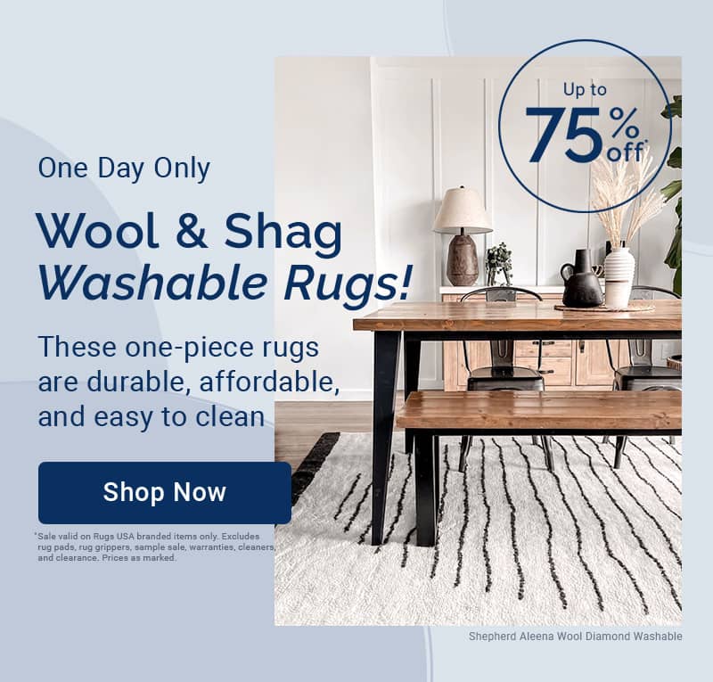
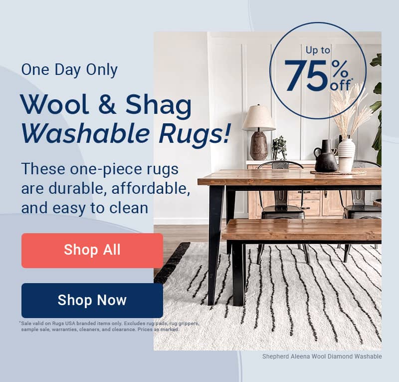
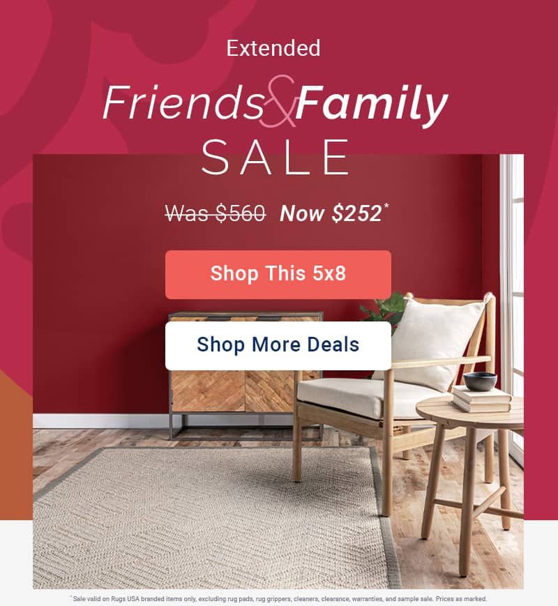
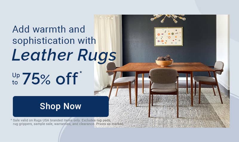
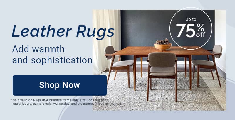
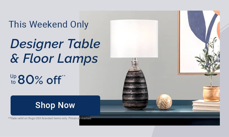
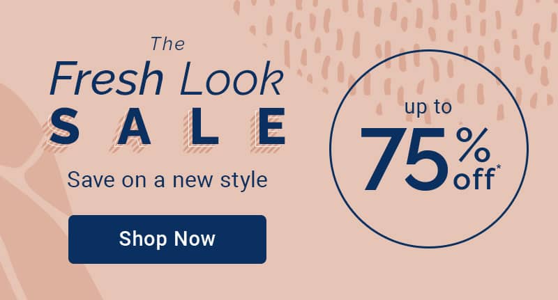
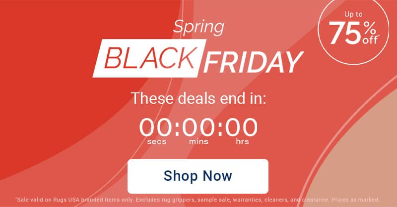
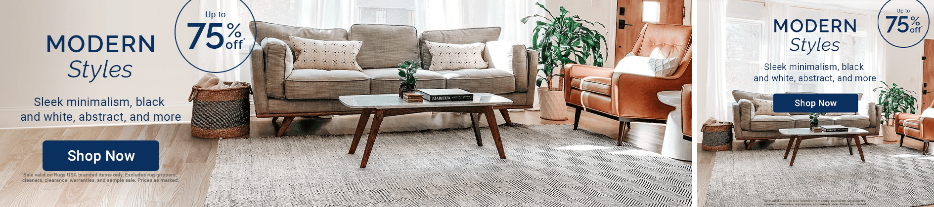
Homepage Heroes
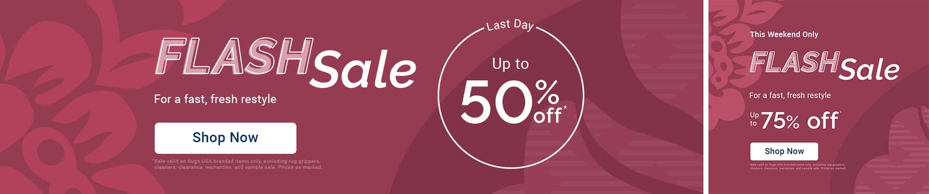
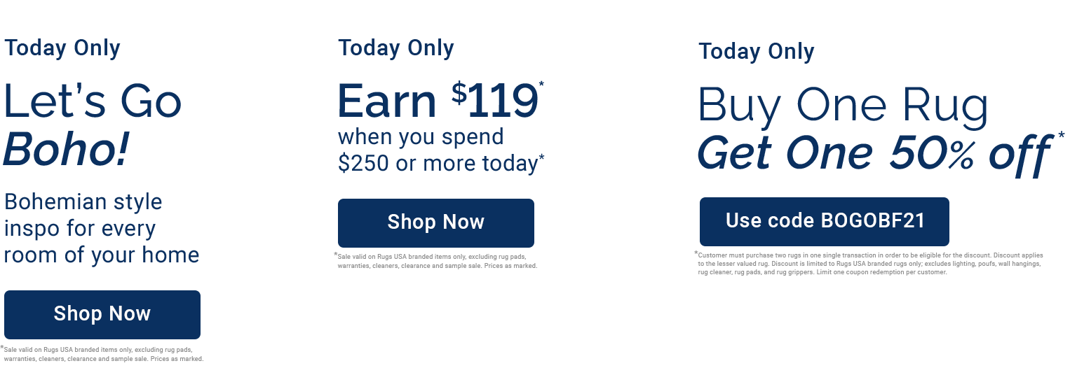
Graphic treatment Only (desktop version on left, mobile version on right)
Photography Only (desktop version on left, mobile version on right)
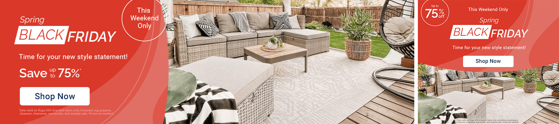
Photography and Graphic Treatment (desktop version on left, mobile version on right)
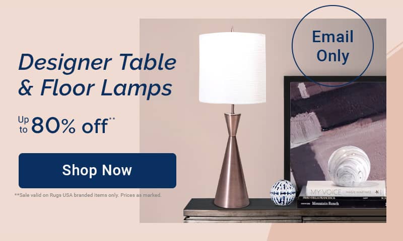
Email Components
Type lockup and CTA color combinations
CTA buttons are available in 3 different colors. The button color you use in emails, banners, site assets, social assets, ads, or other creative will depend on the color background it is on. For example, if the color of the creative is saturated like orange (#f05f57) or a Mid-tone you should use a white button. If the color of the creative is a light color or white, you can use a Navy or Orange CTA.
These CTA color combinations relate to emails and site assets
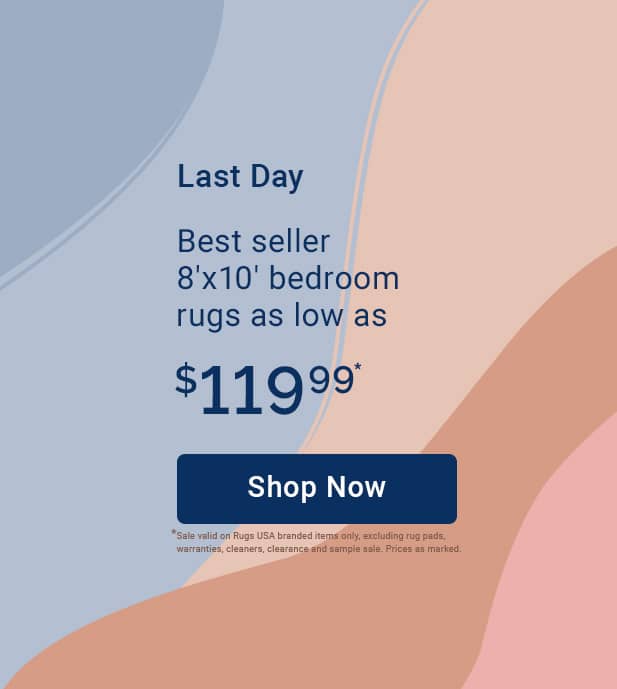
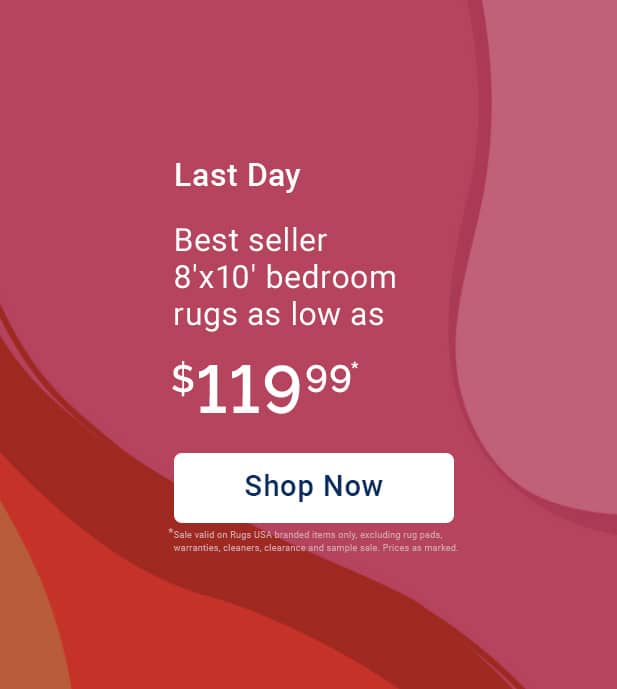
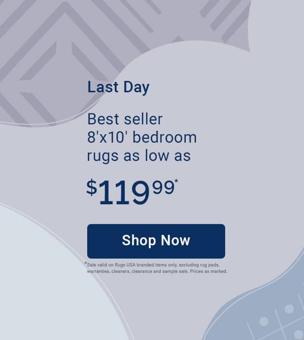
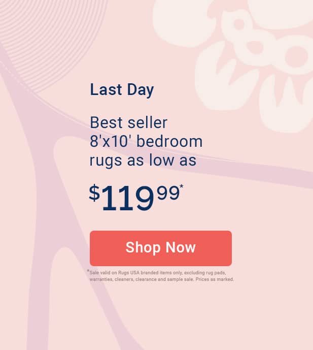
CTAs
Background color: #0a3060
Text color: #ffffff
Background color: #f05f57
Text color: #ffffff
Background color: #ffffff
Text color: #0a3060
Email Dividers
- The font size should always be 40px
- The typeface should be Raleway Semibold Italic
- Text tracking should be Optical
- Text tracking should be 20
- Text should be sentence case
- There should be 40px padding on the left and right of the text
- Maximum character count should be 19 characters
background text color: #dddee9
Examples


Email Size Tags
Tags in email indicating rug size should go on the top left of UGC or studio photos when the referencing a specific rug size.
- Always use straignt quotes to indicate sizes
- Font: Roboto Regular
- Font size: 32px
- Text tracking should be Optical
- Text tracking should be 20
- Tag background color should always be "Cherry" (#9C0D38)
- Tag text color should always be white
Examples
Email and Homepage Lockups
Font styling for email heroes:
- Use Raleway for headlines and Roboto for body copy
- Use Anti-Aliasing: Sharp
- All Tracking should be Optical
- All text on light backgrounds should be #0A3060 (New Navy)
- All text on dark backgrounds should be #ffffff (White)
- Raleway Semibold should be used in place of Raleway bold or Raleway black
- Do not use raleway thin or Raleway Extralight
Eyebrows:
- Roboto Medium and/or Semibold—32px (using tabular lining for numerals in properties palette)
- Optical Tracking: 10-20
Headlines:
- Raleway (using tabular lining for numerals
in properties palette)
- 45-60px
- Optical Tracking: 10-20
Sub head:
- Roboto Regular—32px
- Optical Tracking: 10-20

CTAs in Email:
- height of button: 70px
- minimum width of button: 285px (variable depending on text)
- margin between text and end of button on left and right: 75px
- font size: 29px
- Roboto Medium
Value prop/Percentage:
- Raleway semibold (using tabular lining for numerals in properties palette)
- “Up to”: Roboto Regular
- percentages and prices should be followed by an asterisk (*)
- Dot whacks should never be filled in (a solid circle)
- A dot whack should always be an outlined circle


Swatches:
- Use a maximum of 4 color ways "swatches" with the addition of a plus sign (+) if more than 4 color ways are available for that sku.
- If the SKU has 1-2 colorways, don't include swatches


T&Cs:
- Roboto regular—10px
- color should be a lighter or darker (but still legible) version of the background color if the T&C is on top of an image
- color should be #ababbd if the T&C is on a white background
Font styling for email body copy:
- Roboto Regular—32px
- using tabular lining for numerals (in properties palette)
- “was pricing”: should always have a strikethrough
- “was pricing”: color=#aaabbc (Gray 4)
- “Their Price” for price comparisons: color=#aaabbc/ size=32px (Gray 4)
- “Our Price” for competitor price comparisons: color=#f05f57/ size=32px (Orange)
Pricing and product name text when in a 3 column grid text:
- Roboto Regular—23px
- product name: color: #0a3060 (New Navy)
- product price: color: #f05f57 (Orange)
- All other copy in the body of the email should be #0a3060 (New Navy)
Secondary CTAs
- CTAs in product grids should be underlined
- CTAs under product grids should be a rounded rectangular button
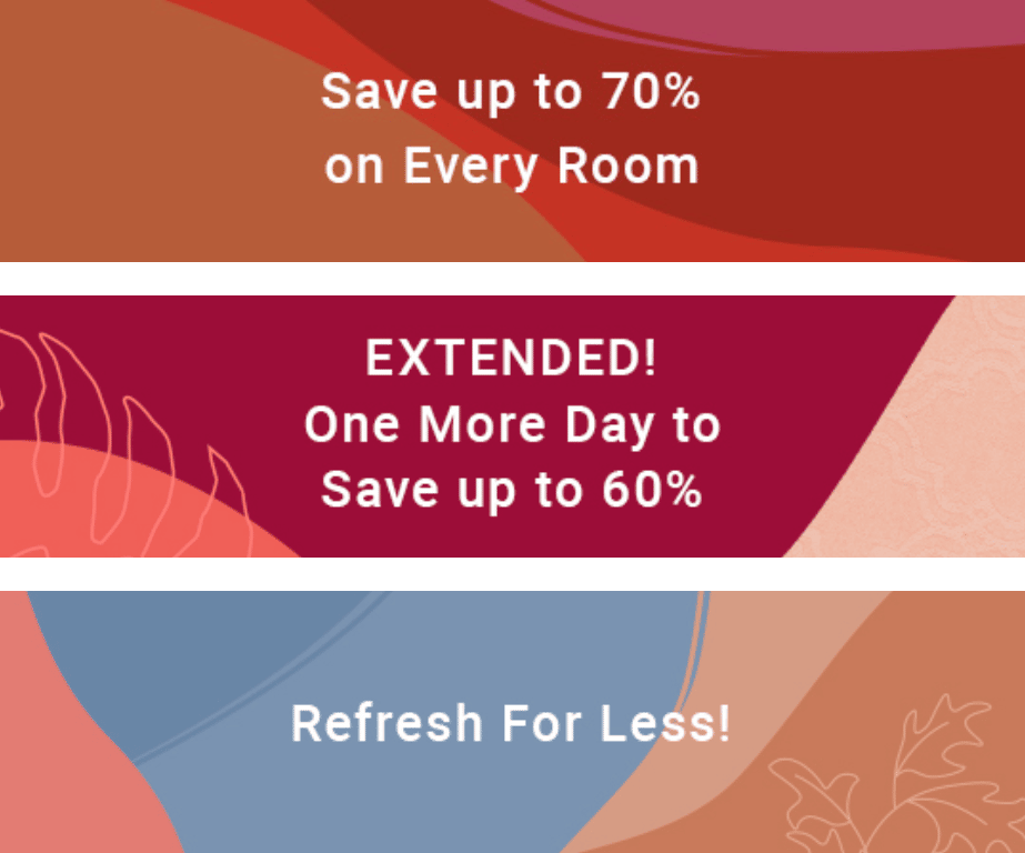
Promotional Email Templates
Social
Instagram stories related to a site sale
If the instagram story relates to a site sale it should use the same design (or an iteration of the HP hero design) and type lockup that is used in the site sale.
- Anti-Aliasing: Sharp
- All Photoshop documents should be 72ppi
- sub head: Roboto Regular—55px
- The color of the text should always be either white (#ffffff) if on a dark background or "New Navy" (#0A3060) if on a light background
- If the design is part of a series, (ie. if there are multiple stories related to one site sale) the type treatment should be consistent across all designs.
Use of photography
Use of graphic treatments
Instagram stories not related to a site sale
Productive and expressive motion each evoke a
- Text should use the Anti-Aliasing: Sharp setting
- All Photoshop documents should be 72ppi
- The color of the text should always be either white (#ffffff) if on a dark background or "New Navy" (#0A3060) if on a light background
- There should be a maximum of 3 different fonts/type styles used in any design. Using more than 3 creates an overly complex, busy, jarring experience. (ie. Do not combine Raleway Italic, roboto italic, roboto regular, Raleway Semibold, raleway regular, raleway medium all in one design.)
- If the design is part of a series, (ie. if there are 2 or more frames in the story) the type treatment should be consistent across all designed frames.
- Eyebrow:
- Roboto Medium or Semibold
- 55px
- (use tabular lining for numerals in glyph palette)
- Sub-head:
- Roboto Regular
- 55px
- (use tabular lining for numerals in glyph palette)
- Value prop/Percentage:
- Raleway semibold
- 105px
- use tabular lining for numerals in glyph palette
- “up to”: Roboto regular—55px